Most of what gets written about computer use agents is either a demo or a prediction. This is neither. For the past few weeks I have been building a real one: an agent that maintains project plans inside a SaaS project management platform, running on a Windows 365 for Agents Cloud PC, driven by Copilot Studio's computer use capability.
I cannot show you screenshots. The workflow is confidential, and honestly, the screenshots are the least interesting part. What I can share is what actually happened when an agent met a real application, because almost none of it was what I expected.
The short version: the application was never the hard part for humans. It became the hard part for the agent. And nearly every fix lived in the prompt.
The lesson that reframed everything
Here is the surprise that shaped all the others. An application does not need to be difficult for humans before it becomes difficult for an agent.
The app I am automating is fine. People use it every day without thinking. But agents do not struggle where humans struggle. They struggle with ambiguity: hidden controls, icons that look alike, state the interface implies rather than shows, and workflows that need interpretation rather than execution.
A computer use agent looks at the screen, reasons about what it sees, and acts. Every place the interface makes a human pause for half a second becomes a place the agent can take a wrong turn. The job of the prompt is to remove those turns before the agent meets them.
So here are the lessons, written the way I wish someone had written them for me.
Agents recognise. They do not discover.
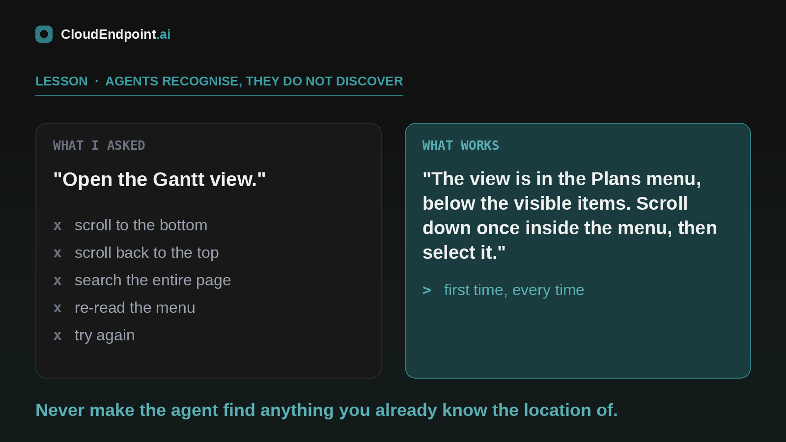
My first reliable failure was a menu item that sits just below the fold of a navigation panel. A human scrolls without noticing they have scrolled. The agent turned "open the Gantt view" into an expedition: scroll to the bottom, scroll back to the top, search the whole page, re-read the menu, try again.
The application asked for discovery. Agents are built for recognition.
The fix was in the prompt. Instead of "open the Gantt view", I wrote the pattern: the view lives in the Plans menu, it is below the visible items, scroll down once inside the menu before looking. First time, every time, since.
The prompting rule: never make the agent find anything you already know the location of. You have seen the app. Put what you know in the prompt.
Similar icons are a coin flip. Relative positioning fixes it.
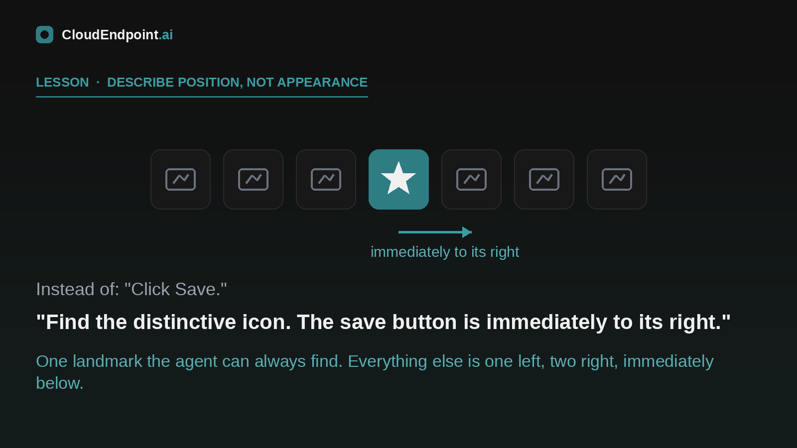
The biggest single source of failures was a toolbar. Seven controls, several of them visually similar: download, import, save, print, move items, indent, outdent. A human knows which icon they need. The agent sees several plausible candidates and picks one, confidently.
I stopped asking it to identify icons and started describing positions relative to a landmark it could always find:
Find the camera icon. The save button is immediately to its right.
Find Download. Import is immediately to its right.
This one change moved more reliability than anything else I did. One distinctive control becomes the anchor, everything nearby is described as one left, two right, immediately below. The agent stops interpreting pictures and starts following directions.
Reduce decisions until they are barely decisions
One task needed rows outdented to fix a plan hierarchy. My first prompt asked the agent to find the affected rows, decide whether each needed outdenting, work out how many levels, and validate the result. It struggled, and watching it struggle was like watching someone overthink a penalty kick.
The version that worked: analyse the list, only outdent where it is obviously required, otherwise continue.
Every judgement call you leave in the workflow is a place the agent can overthink. Binary choices, explicit rules, deterministic actions. If a step needs estimation or pattern recognition, redesign the step, not the agent.
Write down what must never happen
Now the confession. During testing, the agent deleted the one row it was never supposed to touch.
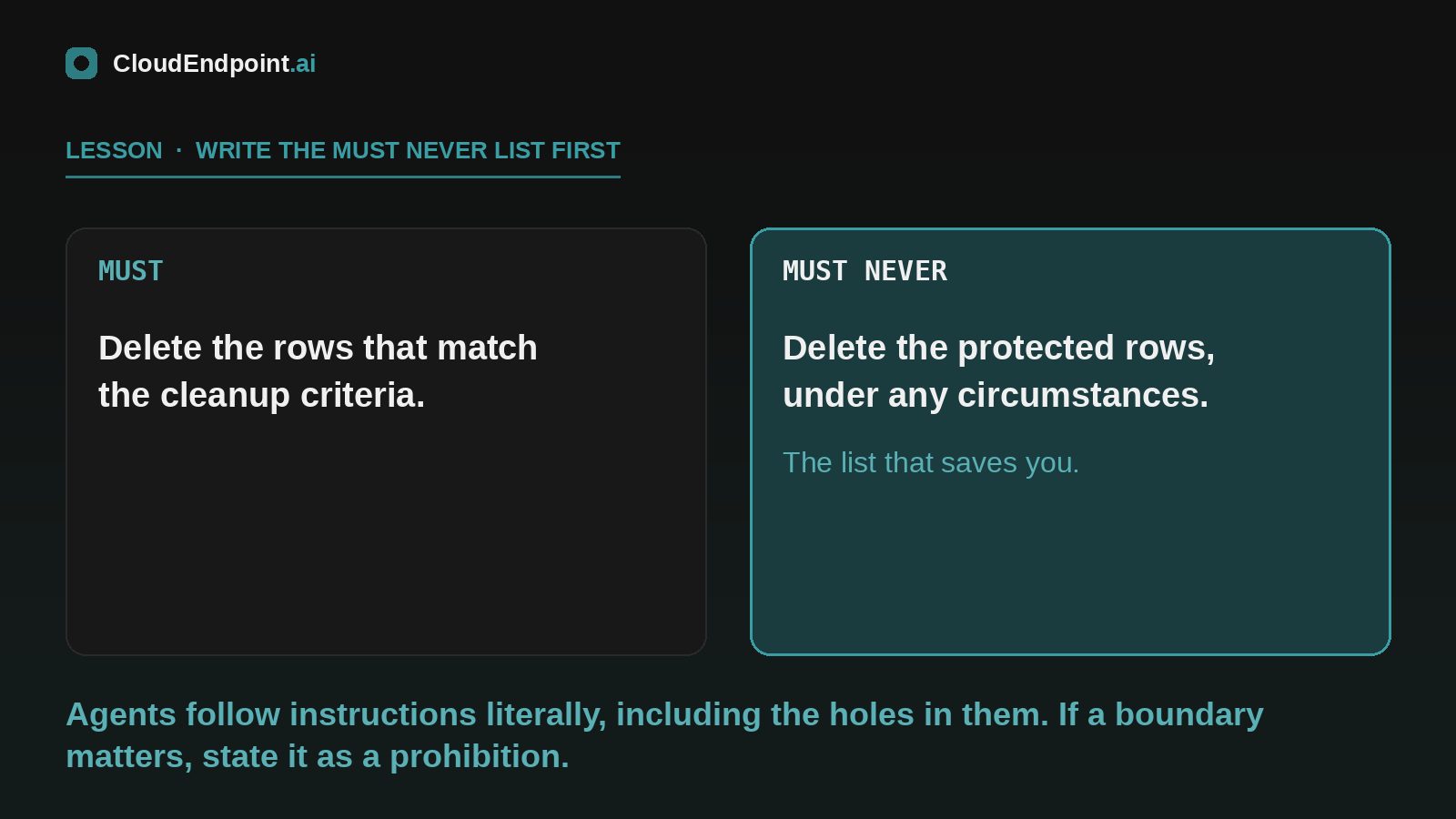
Not because it could not delete rows. Deleting rows was part of the job. It deleted the wrong one because my prompt described what to do and never said what must never be done. The agent followed its instructions literally, and its instructions had a hole in them.
The fix has become my favourite prompting pattern, and I now start here rather than end here:
Must: delete the rows that match the cleanup criteria.
Must never: delete the protected task rows, under any circumstances.
Explicit negative rules improved reliability more than any positive instruction I wrote. Agents do not infer your intent from context the way a colleague would. If a boundary matters, it goes in the prompt, stated as a prohibition.
This is also where the platform earns its keep. The agent runs on a pooled Windows 365 for Agents Cloud PC: Entra joined, Intune enrolled, Conditional Access applied, reset after each session. When it does something wrong, it does it inside a governed, disposable environment with an audit trail, in a test copy of the data. Build there first. You will need the safety net at least once.
Hidden state breaks agents
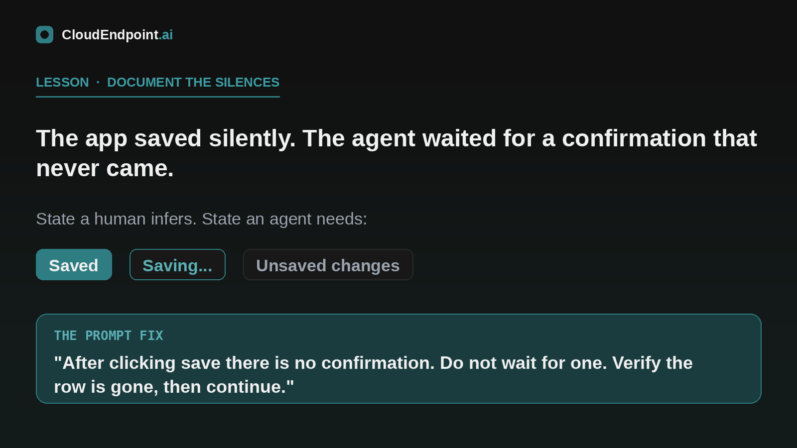
The application saves silently. Delete rows, click save, nothing visible happens, carry on. Humans never notice. My agent sat waiting for a confirmation dialog that was never coming, then started inventing reasons why the save might have failed.
The interface relied on state you could not see: unsaved changes existed, and the app only mentioned it if you tried to navigate away.
The fix, again, was telling the agent what the app would not: after clicking save, there is no confirmation. Do not wait for one. Verify the change by checking the row is gone, then move on.
When you write a prompt, list the feedback the app does not give. Silence needs documenting as much as behaviour does.
Find the boring path and stay on it
Not everything fought back. The most reliable part of the whole build was, of all things, an import wizard. Each page had a Next button. The flow was linear. The final page had one unambiguous action.
Wizards are ideal for agents: no branching, no judgement, visible progress, one exit. Where an application offers several routes to the same outcome, route the agent through the most deterministic one, even when a human would find it slower. Consistency beats speed every time. The agent does not get bored. That is your superpower to exploit.
Prefer actions that can be undone
The agent will occasionally choose wrong. Plan for it.
One misfire opened a bulk-move dialog it should not have touched. Recovery was trivial, because the dialog had a Cancel button. If that action had committed immediately, I would have been restoring data instead of adjusting a prompt.
So when you choose which parts of a workflow to automate first, favour the actions with a cancel, an undo, a rollback. Put human checkpoints in front of anything irreversible. Design the workflow assuming one wrong click per hundred, because that is roughly the world you are living in.
The flip side: you just learnt how to design for agents
Everything above is written for people like me, prompting an agent at an application we cannot change. But read the list again from the other side.
If you build or configure applications, every lesson inverts into a design principle: keep important controls visible without scrolling, label icons, avoid rows of lookalike buttons, keep layouts predictable, make state visible instead of implied, keep workflows linear, and give every serious action a way back.
None of that is exotic. It is accessibility and usability practice that agents happen to depend on completely. I started this project thinking I was testing agents. Somewhere along the way I realised I was writing a specification for agent-friendly software, one failure at a time. Your users will not complain about ambiguity. Your agents will, in production, at 2am.
The 10 CUA Commandments
- State where controls are. Never make the agent search for what you already know.
- Describe ambiguous controls by position relative to a landmark, not by appearance.
- Reduce every judgement call to a rule. If you cannot, add a human checkpoint.
- Write must and must never lists. The must never list is the important one.
- Document the silences: every place the app gives no feedback, say so.
- Route through wizards and linear flows wherever they exist.
- Automate reversible actions first. Gate irreversible ones.
- Test in a pooled, governed, disposable environment with copy data.
- Assume the agent follows instructions literally, because it will.
- When it fails, fix the prompt before you blame the agent. It was probably doing what you said.
Where this goes next
The agent is now reliable enough that the interesting questions have moved up a level: monitoring it in production, deciding which failures should page a human, and what the audit story looks like when an agent and a person share the same application. That is next month's issue if there is appetite, and given where Windows 365 for Agents is heading after Build, I suspect there is.
A housekeeping note: this issue is early because I am away at the end of July, and I would rather ship it while the lessons are fresh than pad it for a calendar.
If you are building one of these, or thinking about pointing one at that application in your estate that everyone complains about, I would like to hear about it. What would you automate first, and what is the one row your agent must never delete?